
The most common colors in ceramics and their meaning
Share
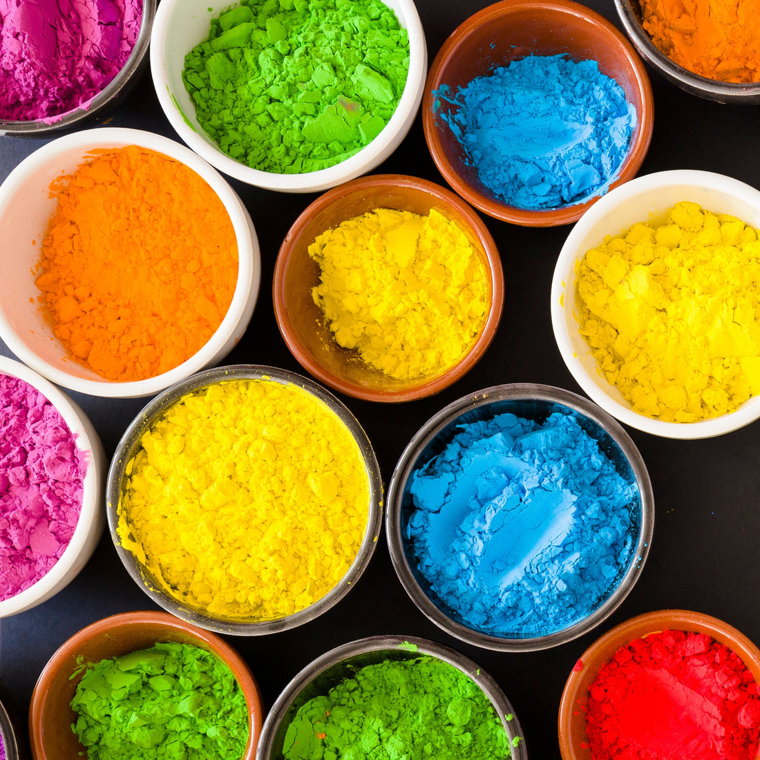
In ceramics, color is not just decoration. It is symbol, emotion, tradition, and technique. The colors you choose for your pieces will not only define their aesthetics but also their message. Today, we explore the most common tones in artisanal ceramics and what they usually represent, both culturally and symbolically.
White: purity and simplicity
White is synonymous with cleanliness, elegance, and minimalism. In ceramics, it is often associated with porcelain and opaque glazes like tin. It is used in pieces that seek to convey serenity or highlight pure forms.
Blue: tradition and spirituality
Cobalt blue is one of the most recognizable colors in ceramics, from Andalusian tiles to Chinese porcelain. It represents depth, wisdom, and connection to the spiritual. Cobalt oxide is responsible for its vibrant tones.
Red: energy and strength
Reddish tones are often achieved with iron or copper oxide, and they are common in traditional Japanese and African ceramics. Red conveys warmth, power, and vitality, and it is ideal for pieces that seek to make a visual impact.
Green: nature and balance
Green is associated with life, growth, and harmony. In ceramics, it can be obtained with chromium or copper oxide, and it is common in rustic tableware or pieces that evoke the organic.
Yellow: light and creativity
Less common, but very expressive, yellow conveys optimism, solar energy, and joy. It is often achieved with yellow iron oxide or specific low-temperature pigments.
Black: sophistication and depth
Black has a dramatic and elegant effect. In ceramics, it can be achieved through reduction with iron or manganese. It is ideal for contrasts and for modern pieces.
Choosing a color in ceramics is choosing an emotion, a culture, or even an intention. From the serenity of white to the strength of red, colors communicate much more than they seem. So the next time you apply a slip or a glaze, remember: you are telling a story in color.